Case study · Client project · 2025
Chaimaa Cataleya
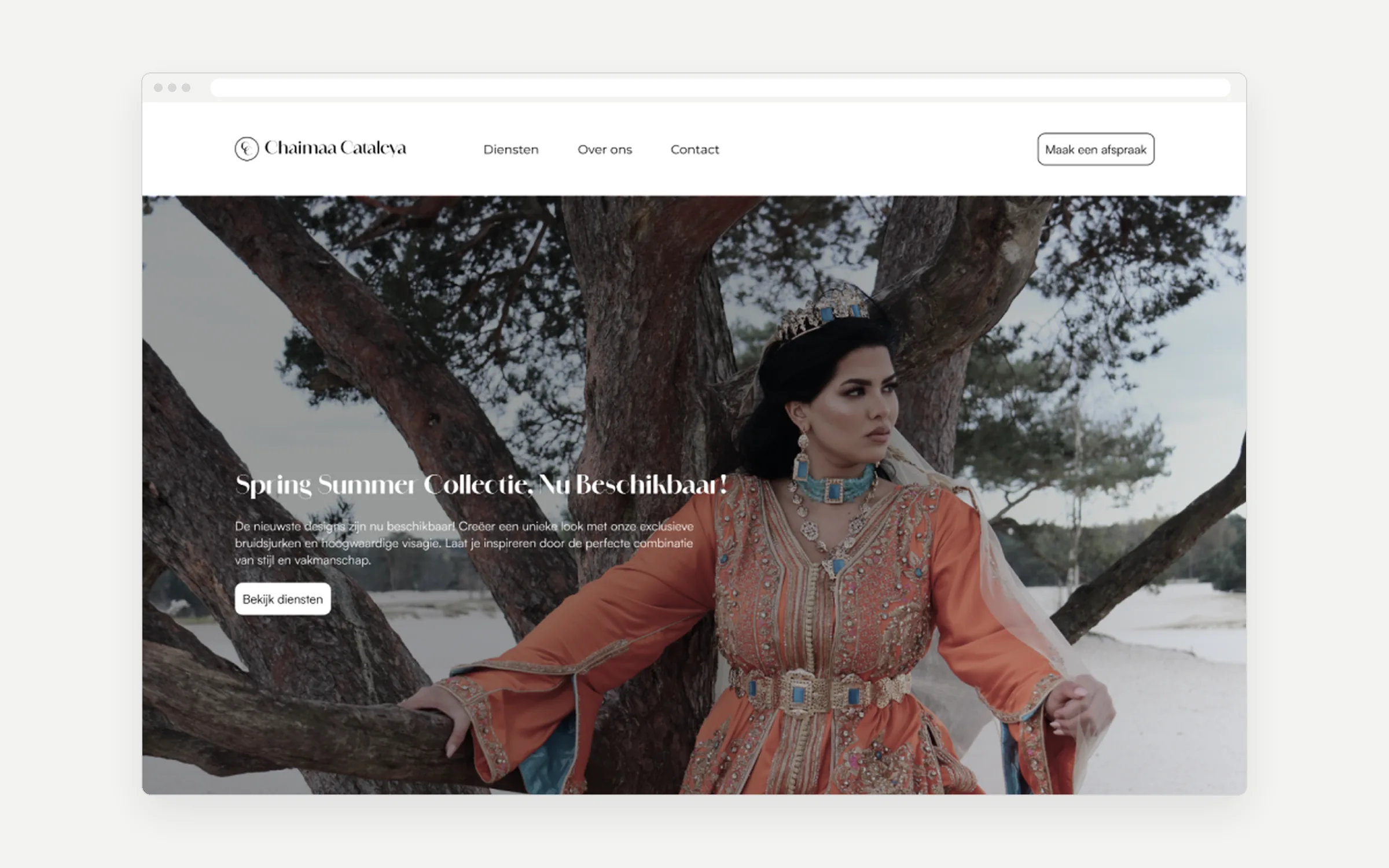
A website for a bridal stylist in Rotterdam who doesn’t show her dresses online. I designed the brand, the website and the booking form.
- The problemNo dress photos, but she still needs bookings
- What I didA luxury brand and booking in 3 steps
- The resultApproved by the client
The problem
The site has to sell the feeling, not the dresses
- The client keeps her dresses exclusive: no photos online. Instagram is her portfolio.
- Most competitors look cluttered, or only have an Instagram page.
- Gold text on cream looked luxurious, but was hard to read.
From the briefing, a competitor analysis of 10 Dutch bridal services and my accessibility check.
What I did
3 choices
Choice 1
Let the brand do the selling
- Why
- Blurry or cropped dress photos would feel less exclusive.
- Trade-off
- Visitors can’t browse, so booking had to be quick.

Choice 2
Booking in 3 steps, with price and time on every service
- Why
- Visitors know what it costs and how long it takes before they choose.
- Trade-off
- Haute couture has no fixed price, so it says “price on request”.
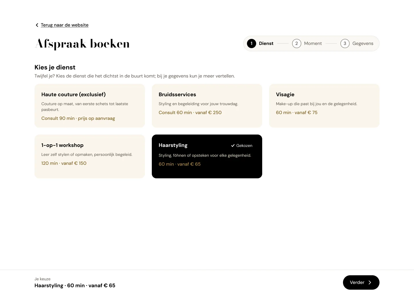 Step 1
Choose a service
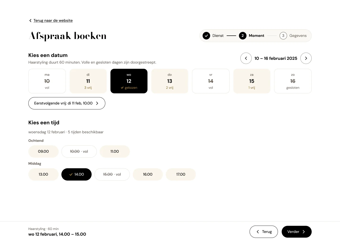 Step 2
Pick a date and time
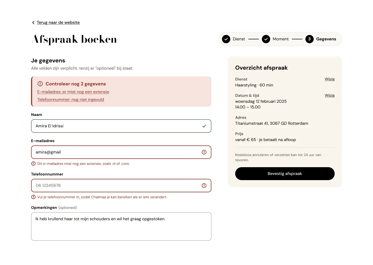 Step 3
Fill in your details
Choice 3
Easy to read, without losing the look
- Why
- Gold on cream was hard to read, so gold now sits only on black, with a darker gold for text.
- Trade-off
- Less gold on light backgrounds.
| Before | After |
|---|---|
| Gold text on cream | Darker gold for text, gold only on black |
| Grey placeholder text instead of labels | A label above every field |
| Buttons 42 px high | Every button at least 48 px |
Result
Approved by the client after 3 rounds
- Easier to readText contrast went from 2.6:1 to 4.5:1.
- Easier to tapButtons went from 42 to 48 px.
Not live yet. Once it is, I’d check how many people finish all 3 steps.
What I learned
Test with real brides, not only the client
The design rounds improved the look, but I never saw a bride use the booking form.